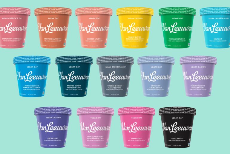
Van Leeuwen Ice Cream has revamped packaging for its vegan pints. In 2016 the Brooklyn, New York-based company worked with Pentagram to create a minimalist design that would stand out in a sea of products in the freezer aisle. Six years on, the Van Leeuwen look has been transformed into full-color and features a repeated vegan call out around container lids and identification of the vegan base of oat or cashew used in recipes. The brand’s well-known logo and copy are projected in white, while the dairy line is black.
“Van Leeuwen’s branding is one of a kind and our customers love the minimalist design and colors of the pints. After taking a step back, we realized there was an opportunity to more closely align our vegan pint branding with the iconic dairy line,” said Ben Van Leeuwen, the company’s co-founder and chief executive officer. “We have no doubt that the changes that we’ve made will increase brand recognition and resonate well with our customers and retail partners.”
Patrons who frequent Van Leeuwen’s 27 scoop shops or make purchases at thousands of supermarkets in the USA will now be able to quickly identify their favorite pints by the color associated with 19 permanent vegan pint flavors, along with many more special flavors in rotation through the year.


